16. Houston Texans
The Texans may be first on this list for uniforms that I’ll say I actually like, as long as we are talking about the blue uniforms and not the hideous red uniforms. What the Texans get right with these uniforms is what the Giants missed. Variety. The red is truly a highlight and compliments the blue. I doubt that these uniforms will hold up over time, but for right now, I don’t hate them.

15. Chicago Bears
The Bears are the first on this list where the old, classic uniform truly is timeless and stands up well through the ages. Or since this list is in reverse, does that make them last? I’d be OK with a new font for the numbers. Those are looking a little thin like my grandpa’s tie.

14. Minnesota Vikings
Purple is a hard color for a grown man to pull off, but the Vikings got it right. And it just looks so good rising above that gold and black. The matte helmets is a little off putting for me, but it’s better than a metallic purple.

13. Baltimore Ravens
Remember what I said about purple being a hard color for a grown man to pull off? What notches the Ravens above the Vikings for me is the secondary color. Black toughens it up quite a bit. However, the font of the numbers on these jerseys leaves something to be desired…but as a Bucs fan, I probably shouldn’t talk much about that.

12. Seattle Seahawks
The Seahawks perhaps take the award for most modern looking uniforms in the NFL. How could you not with Neon Green as one of your colors. Our twin sister franchise found two colors of the right shade that perfectly complements each other. But God forbid those two colors ever get swapped…if they do, break out your solar eclipse glasses, you’re gonna need them to be able to watch the game.

11. Tampa Bay Buccaneers
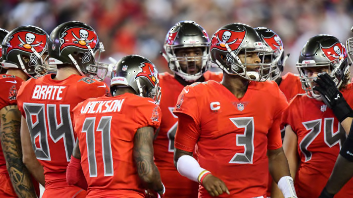
I know a lot of people have problems with the Bucs uniforms, but I really like them in every color, as long as we aren’t wearing white on white. I like the modern feel of the design, but I have to admit that they won’t stand up to time. These uniforms don’t top the Super Bowl era uniforms, we all agree on that. But I like every thing about these uniforms…except the numbers. The Bucs aren’t the only team in the NFL to have a weird font for numbers, but at least others don’t remind everyone of an alarm clock, and no one likes alarm clocks. But other than that, I’m a fan of these uniforms, though I look forward to a change when they are able.
Must Read: EDGE, Chad Thomas Profile

10. Indianapolis Colts
Where the Giants failed in too much simplicity, and where the Lions failed in color shades, the Indianapolis Colts gets it all right with a simple, classic vibe with sharp colors for a look that will stand the test of time. You may notice a theme here now that we are in the top ten.

9. Oakland Raiders
Black, White, Gray. Put them in any order, and it works. Just like the Raiders’ uniforms. Simple, classic, and they stand the test of time.
